How to Make a Chart on Mac’s Numbers App
There are times when we need to create a chart or graph on Mac, and some of us may not know how to do that. So today we are going to explain how you can create a chart on Mac’s Numbers App.
Numbers app are similar to Microsoft’s Excel, and it saves the files in .Numbers format by default, but you can also save it in .XLSX. If you want to know how, please read our article; How to create Microsoft Office compatible document on Mac.
If you know how to create a Graph on Microsoft Excel, we assume you know how to do it on Mac as well. To make a simple chart on Number’s App in Mac OS X, you can follow these steps;
- Launch Numbers App
- Click on New Document
- Double Click on a Blank Template to select and open
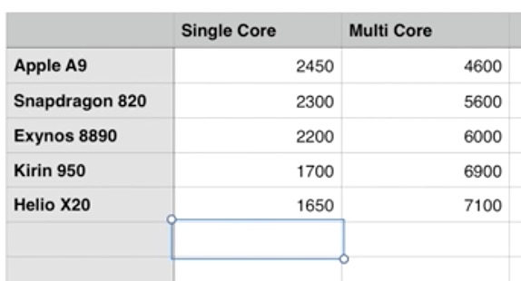
- Now fill the item name in the gray color cell that is located vertically, Put the Item name and Press Enter to go in second row, and put the value again Just like we have did in the below screenshot. We have selected 5 Mobile Application Processors to compare
- Now Enter the item name in gray color cell (located horizontally) that you wan to show in the graph
- Finally Enter the comparison values
Note : Performance scores are just an example, and it doesn’t relate to real score.

- Now Select the entire data, and click on Chart
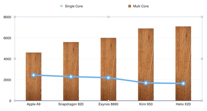
- Select the desired chart, and chart will appear. You can see the sample output below, for the data we entered above

The value we put in the white cells appear at the side, and the graph with blue line shows the single-core score, and the graph in wood color shows the multi-core performance (you can customize graph design when you click on chart). It’s up to you how you want the chart to look like. At the top of the chart, the detail is also give to understand which one represents single or which one multi-core.
Still facing issue? Watch the video below that will guide you how to create a Chart using Numbers App on Mac OS X
